Emulating Aerochrome

History
If you are reading this you probably already know about the iconic look of Kodak Aerochrome film.
The iconic false color Infrared film used for Arial photography produced vibrant red/purple images of vegetation. It's origins where for surveillance as artificial structures would stick out.
Eventually it made its way into the hands of photographers. A number of album covers allegedly used the film for its surreal colors. The first artist that made me fascinated by the film was Richard Mosse work in the Democratic Republic of Congo.
But if you are like me, between the difficulty and expense of purchasing and using it, I never was able to shoot the real thing.
The best place to start when trying to replicate something ourselves is to take a look at the orginal.
Luckily we can view the datasheet to understand what is happening.
On the first page Figure 1. Provides the best information for how the false colors work showing how the different layers are exposed and then how it results in the resulting false colors.
Input light from Blue to IR(White) end up creating the resulting color in the final image.
It's basically a shifting of the spectrum right trading away blue for IR.
 |
| simplified AIR color mapping |
Our problem is we do not have any IR to map to red, but it does give us some ideas on what to try.
This highlights our biggest hurdle in trying to replicate the look, but also gives us insight into some
If we focus on the types of photos we typically see done with Aerochrome Aerochrome tagged images on Flickr a couple common traits become obvious.
The first is there must be a lot of vegetation. Plants show up different in IR, and so without them featuring in the image, the results risk looking a little mundane and/or flat.
The second is prominence of a clear sky. Even though all three primary colors are used in the film, the resulting images mostly are contrasting reds and blues. Without something blue, we risk having a pretty monochromatic pallet.
I will pick a generic landscape of a green hill against a blue sky. A pretty safe choice for being a potential Aerochrome photo.
 |
| Our Reference Photo |
Approach 1
The first steps will be using Gimp as a photoshop stand-in as it's a freely available tool that gives much of the same functionality.
For those who have done some photo editing in the past the most obvious choice to try and replicate the look is to try and select everything green and simply shift the Hue red.
The effectiveness of this method is highly tool and skill dependent.
We can try using the Hue Adjustment and shifting green to red.
 |
| Green Adjusted Red |
But because what we think as green vegetation actually can be much more cyan/yellow in value it ofthen makes this a bit harder.
We could try to shift the yellows red too. In this photo it's pretty safe, but it still doesn't help with the greens that are a bit cyan.
 |
| The Cyan tones remain unaffected |
The next would be to try and shift our Cyan tones to Red as well, but without masking, we now risk affecting the sky.
This approach requires a lot of fine tuning and editing per each photo to replace all of the desired colors without obvious artifacts.
It can work (And it does work in tools like C1), but it would be better to have something that gets us close with little effort before we go to edit the photo.
If we revisit that first figure on how Aerochrome works, and look at how other IR images are colored digitally
We notice that the fundamental technique is a channel swap.
The only major hurdle is that there is no IR channel for us to swap.
So we need to figure out what channel swapping options would work best for us.
Channel swapping takes the values from one color and lets us blend them in a different color channel.
To start we know that we want what appears green to appear red. So within the channel swapping tool we can move the green signal into the red channel.
 |
| Moving Green to Red |
 |
| Result of Green to Red |
It isn't the result we want. The image is way too dark, and way too purple.
The reason why is that we need something in the green channel to provide neutral colors, and to provide accurate luminance information to our eyes.
That means something has to go into the green channel.
The first choice might be to simply leave green alone.
 |
| Green Remains in Green |
Not removing Green gives a better look, but we end up with yellow. Which makes sense as Red + Green gives yellow, and everywhere that was green is now equal parts Red.
We could try swapping them instead.
 |
| Red/Green Swap |
 |
| Channel Mixing |
 |
| Blue to Green |

The method is straight forward and easy, but has a couple drawbacks.
- It doesn't work well in most Raw Editors
- You only really have two colors.
 |
| Input Colors to Output Colors |
 |
| Applied LUT |
 |
| Result |
We can make stronger or weaker versions of these LUTs to try and cover more situations.
 | |
|
These are the ones I made to play with. You can adjust the colors by shifting the WB and/or by using the hue sliders.
Which lets you make the images shift between purple/red/orange and shifts what ends up being red or not.
It's a good trick to get the look. And we can now apply it to a number of photos as long as they have something green to swap.
This does save you from the hassle and cost of trying to shoot Aerochrome.
But you can see under closer inspection some things just are not quite right. A lot of tweaking is still needed for decent results.
There are options out there:

Fortunately, there is.
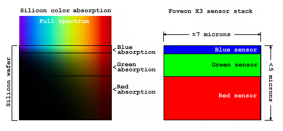
One of the easiest cameras to shoot IR with are Foveon Cameras.
Once you remove it, you get a full spectrum camera.
 |
| Full Spectrum image Foveon SDQ |
But the results aren't as good as we would want. Everything is way to red/purple.
To make our choice we need to start with how the sensor behaves. The Foveon sensor works a little differently than a normal camera as it measures color from how deep the light penetrates.
 |
| Foveon (Wiki) |
 |
| Approx. Response Curves |
But, because of this crosstalk, if we could find a filter that blocked enough red and blue just the right amount we would have:
Luckily someone went ahead and did the hard work of finding some filters for us.

 |
| In Camera View |
 |
| In Camera results out of SPP |
 |
| IR with Filter set to 2500K |
 |
| IR with Filter set to 2500K Adjusted |
 |
| IR with Filter set to 2500K With LUT |
This isn't even a well-tuned LUT.
But it's possible to try and be a bit better by simply measuring and trying to build a better profile that tries to take into account what the filter is doing.
 |
| Reference CC24 |
 |
| Applied Argyll Matrix |
 |
| Basic Edit with LUT |
 |
| Oranges shifted Red |
 |
| Manual tuning |
 |
| Basic Edit with Manual Tuned LUT |
One thing to note, is that no specific edit is more correct. These are false color images, so part of the process is to make creative decisions in how the colors should look.
While I like the last results the most, it's not really anymore "right" then any of the other edits I made.
But like everything when it comes to Photography there are almost always other options out there.
RNI images have a series of presets for LR/C1 that look like they produce convincing images.
But I suspect they suffer from the same flaws as the earlier approaches above.
The type of scene is incredibly important for the effect, and lacks the subtle nuances you get from real IR.
But if you do have an IR converted camera, there are filters that try to accomplish a similar thing as the Foveon approach.
Or you can try other false color films.
Lomography Purple is a similar idea, but doesn't have the IR sensitivity of a true IR film
Final Thoughts
I do think there is value in trying out one of the faux IR techniques if you have ever found the look of Aerochrome images intriguing.
It's a straightforward process that maybe unlocks a new way to take photos.
But going further to edit real IR photos to get the look, my honest opinion has been that it's not worth the effort.
I've had access for years and taken hundreds of IR photos, and my personal opinion is that as interesting as the world can be in IR, there just are too many factors that have to line up to make an image work well.
The false colors are usually not enough on their own to be compelling.
I find that I would rather just take a photo with the normal visible light I know.
And without the personal passion for IR photography myself, it's always remained more a curiosity.


https://kolarivision.com/post-infrared-photo-editing/infrared-photography-false-color-tutorial/
Comments